Distributions
So far we have been looking at histograms, which contain the measured data for a collection of objects or observations.
Often we can construct a mathematical model of these histograms that allow us to reason and make predictions.
These mathematical models are called distributions.
Here is an ideal uniform distribution. 
This is a representation of the random data from that distribution. Note the density of dots is fairly even across the range.
Here are the same data listed out.

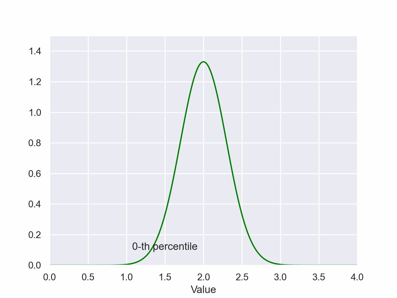
Non-uniform distribution
Here is an ideal normal distribution. Notice that the value of the
density takes on a range of values. 
This is a representation of the random data from that distribution. Note that the density of the marks representing the data is greater near the middle as the y-axis of the distribution suggests.

Here are the same data listed out. The density in the middle of the range is still apparent.

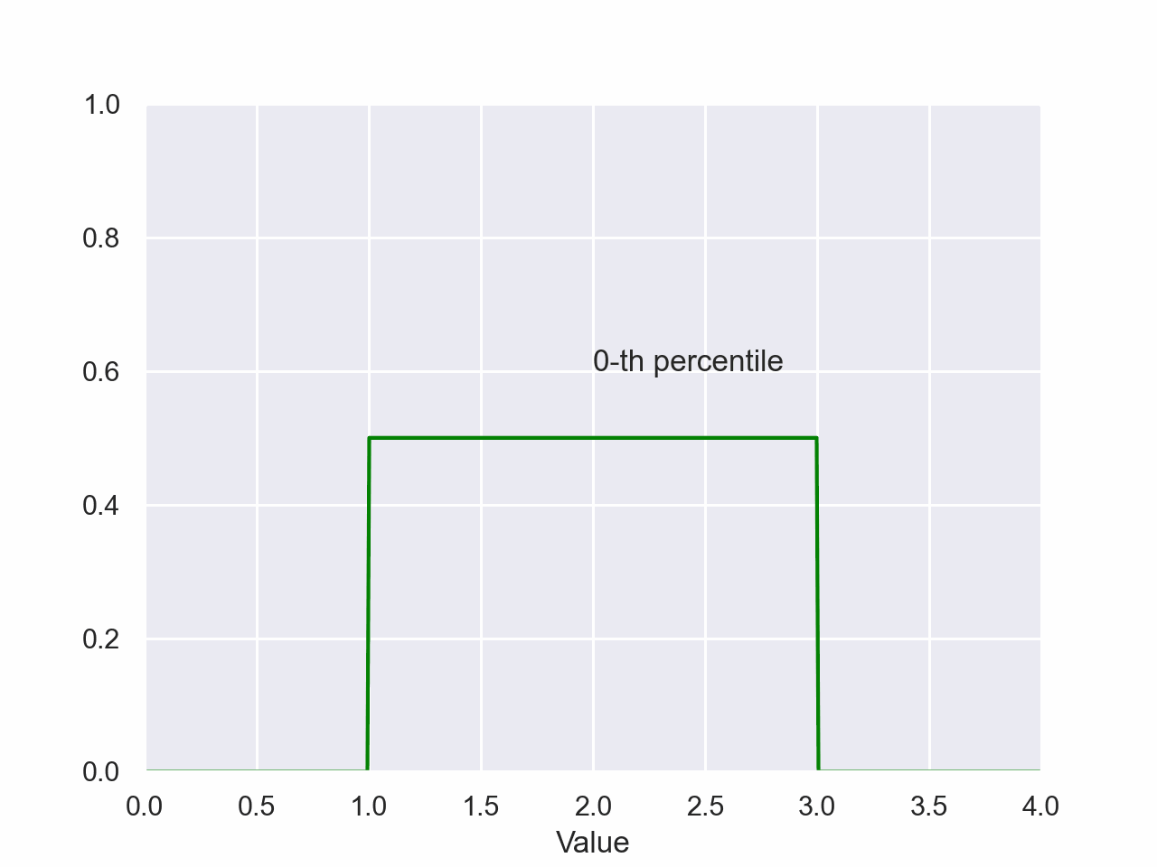
Uniform Percentile
source.py:155: MatplotlibDeprecationWarning: The seaborn styles shipped by Matplotlib are deprecated since 3.6, as they no longer correspond to the styles shipped by seaborn. However, they will remain available as 'seaborn-v0_8-<style>'. Alternatively, directly use the seaborn API instead.
  plt.style.use('seaborn-pastel')
The magnitude of the shaded area is the probability of a value falling between the shaded regions of the x-axis. The value on the x-axis of the right side of the shaded region is the value of the percentile.
Triangular Percentile
source.py:211: MatplotlibDeprecationWarning: The seaborn styles shipped by Matplotlib are deprecated since 3.6, as they no longer correspond to the styles shipped by seaborn. However, they will remain available as 'seaborn-v0_8-<style>'. Alternatively, directly use the seaborn API instead.
  plt.style.use('seaborn-pastel')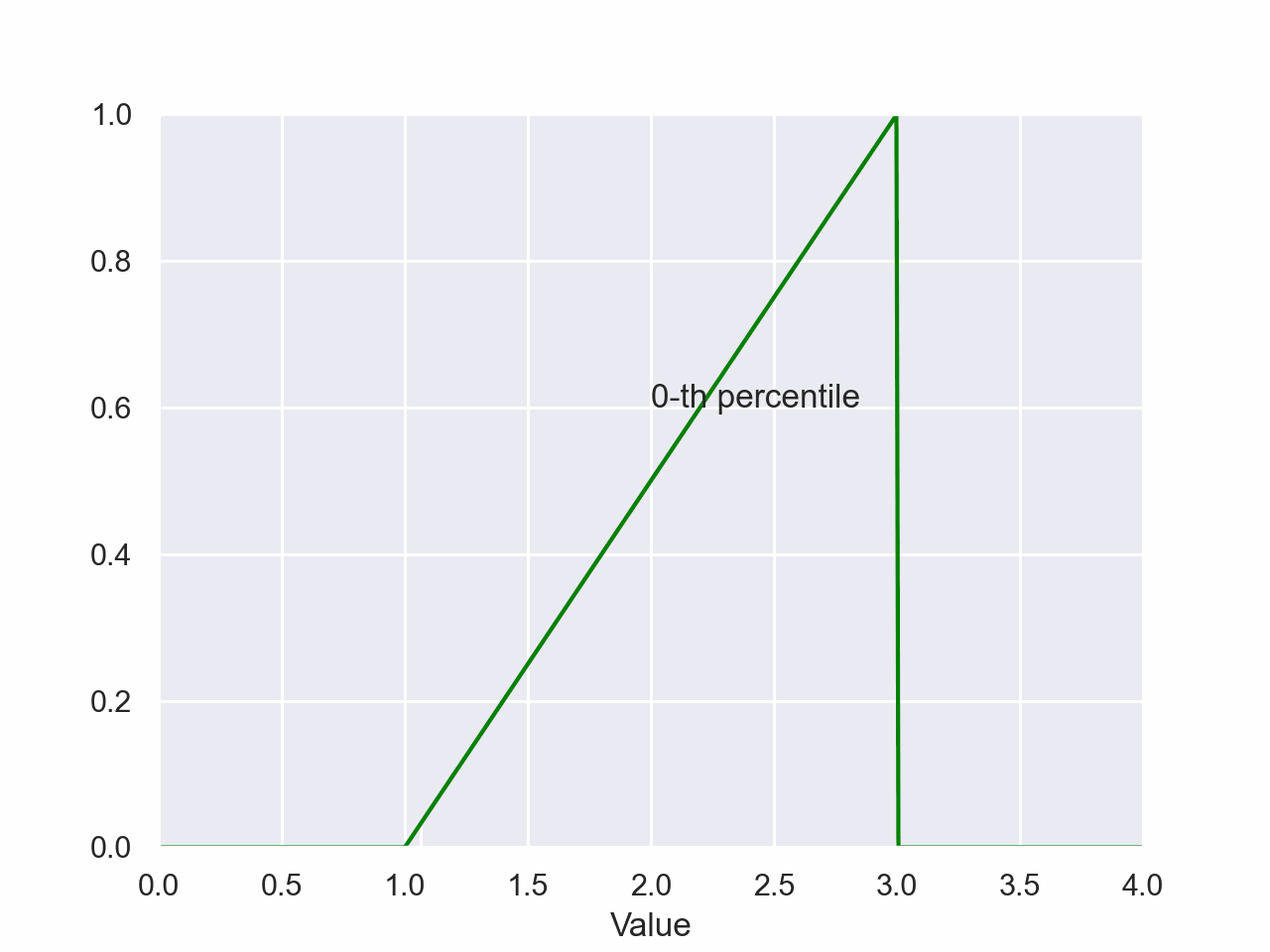
Normal Distribution Percentile